About GoodLoot
GoodLoot, part of the Cenega group, sells a wide range of gadgets, accessories, merchandise and games from the fantasy-pop culture world including Star Wars, Star Trek, Marvel and many gaming universes.
The challenge
Cenega group wanted to massively overhaul the GoodLoot brand and turn the brand into a self-sufficient e-commerce store, but also completely redesign the business from the ground up.
The challenge ahead was to introduce a fresh narrative of the brand and what it does, but also communicate this in a consistent, coherent manner over all mediums.
Ultimately, Cenega group’s goal was to create the number one geek store selling both licensed merch and it’s own branded products.
Frontkom’s task was to help our client to bring an old, archaic branding into the modern era, while also preparing it to scale up in years to come.
Discovering the real goals
The first step in the rebranding process is to understand both the current and future needs of the client and the brand audience’s universe.
Branding workshops with key stakeholders were held to build a strong, clear vision for the client’s long-term business strategy, new brand positioning, and the direction they wanted to take it. Aligning the visions of the key stakeholders was also crucial at this point.
Those branding workshops allowed us to turn a set of rough ideas and business strategies for the brand into specific and much more tangible creative concepts which could represent them. With those, the entire Cenega team could agree on next steps, and work with them further.
According to the workshop outcome, one of GoodLoot’s long-term goal was to create their own clothing line to further build brand advocates. This meant that the final branding had to be versatile enough to influence fashion.
The branding process
This fashion brand’s concept was to mix its own geek DNA into traditional streetwear. It was important to also deliver a feeling of quality and be attractive, accessible and recognisable to a wider audience.
We then spent time together with the Cenega team explaining the re-branding best practices. This ultimately enabled them to understand the “why” of what’s happening. Furthermore, it enabled our client to make more conscious decisions regarding their brand during this project and also in the future.
Then we got to work on the right symbols.
The one consistent image we found resonating in multiple elements of the brand, as well as its customers, was the concept of a portal.
“This is the word we were looking for, but just couldn’t find,” said the GoodLoot team when we presented our idea.
Departing from the concept of treasure (loot) as a box, we focused on the service that connects fans to the world of their beloved franchises. GoodLoot as an ecommerce store (the portal), connects these two worlds..
How we worked
GoodLoot was very specific in what they wanted and expected to get that, but also placed a lot of trust in the Frontkom team. The GoodLoot team understood that what was happening was a process. This process had specific ways that it needed to be executed in order to get a quality result.
Thanks to the Agile work method, we held regular sync meetings both internally and with the LootGear team. Quick iterations and corrections from the brand made it easier for us to reach their desired outcome, but also measure the effectiveness and efficiency.
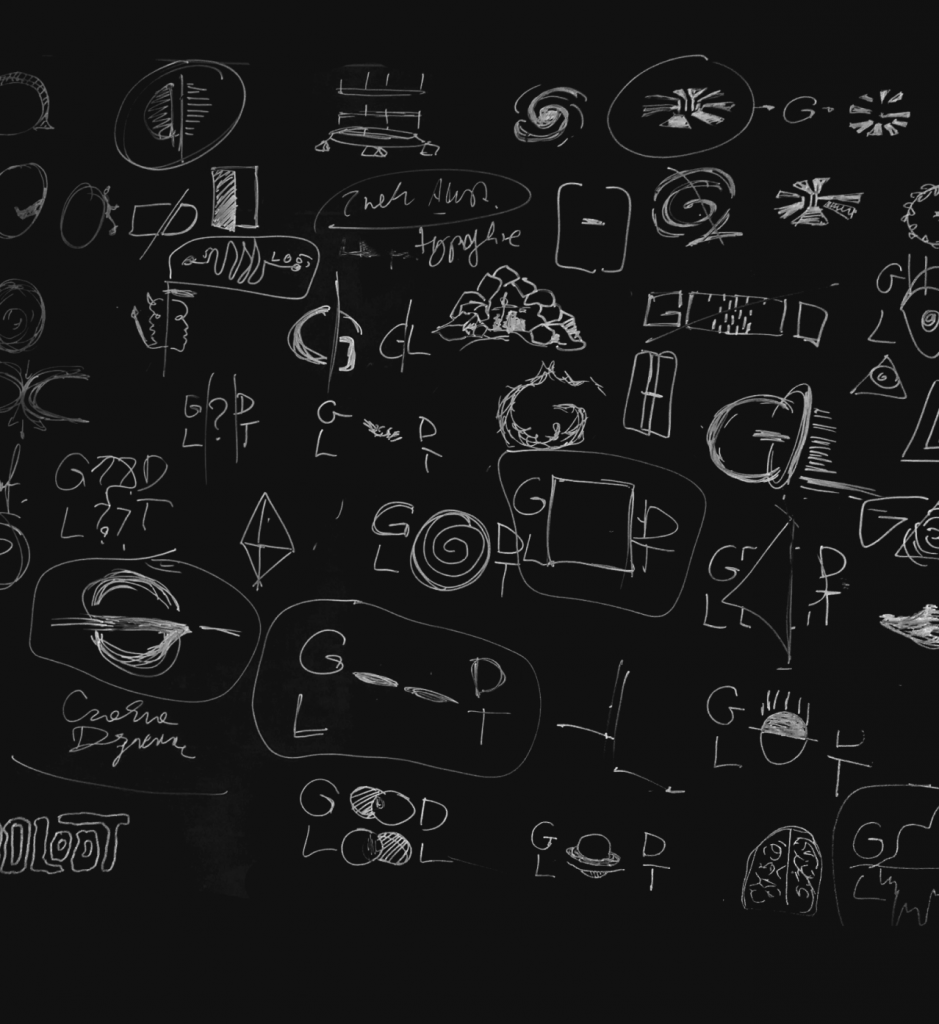
Sketches and digitalization
Our fresh suggestions were taken into account and feedback was given and taken both ways in a clear, constructive manner. After holding internal workshops, we did our own research and produced numerous whiteboard and paper sketches of potential solutions. The next step was digitization of the best of these sketches.
Final design
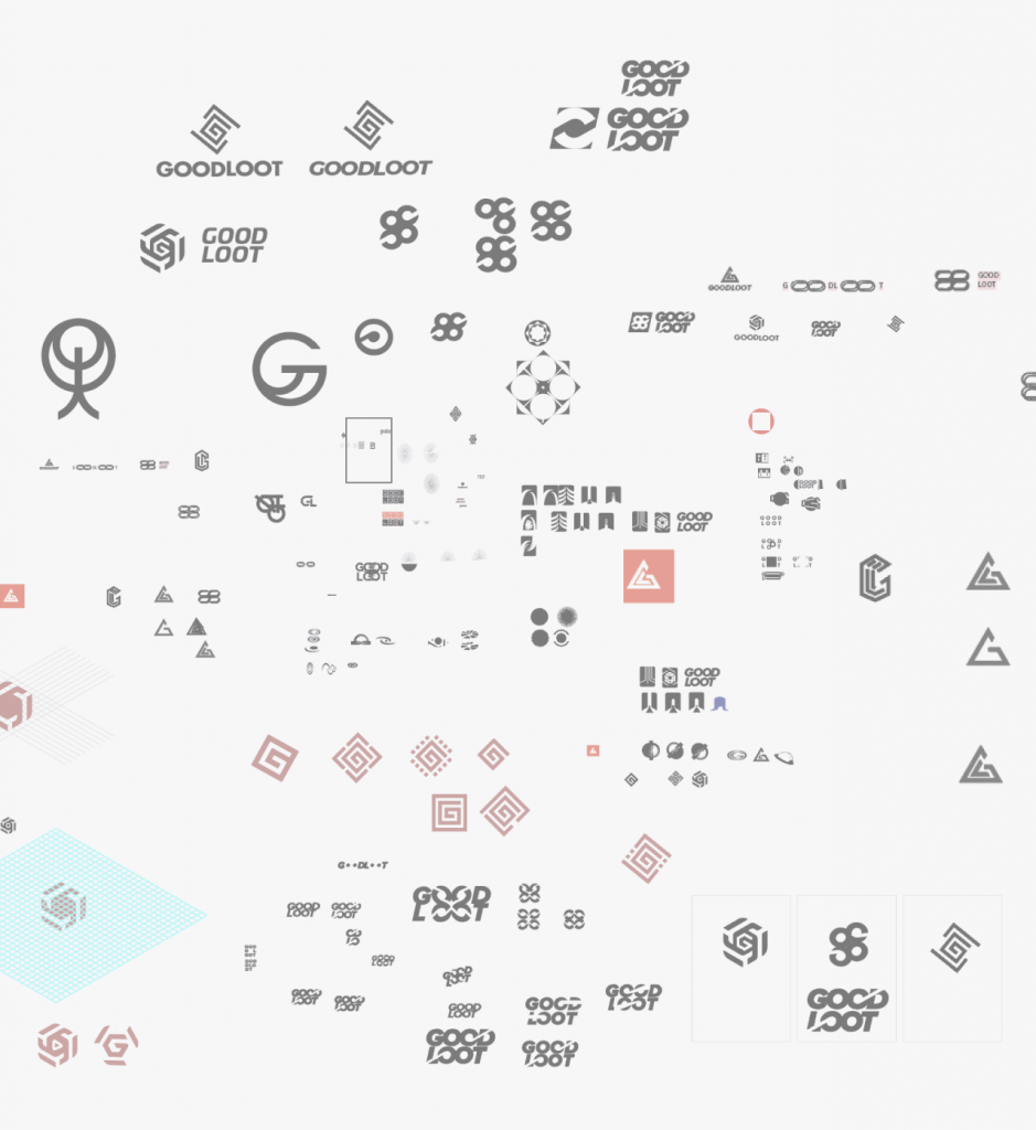
We narrowed down the 3 strongest and most-suitable ideas and presented them to the client. The GoodLoot team picked their preferred option and we began to complete the picture.
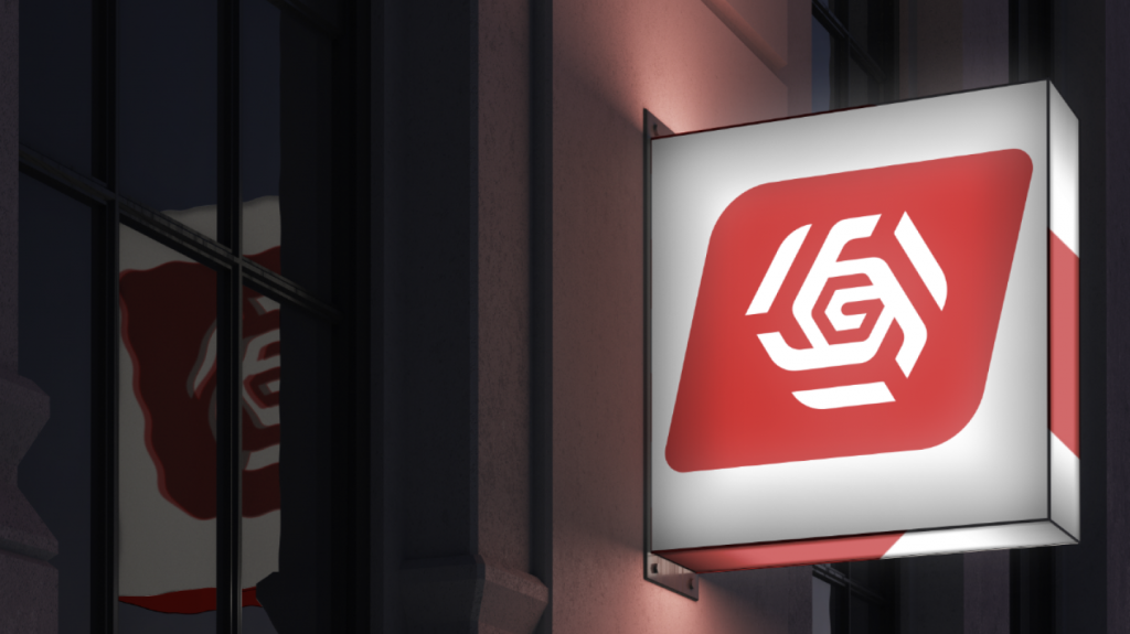
The winner was the complex exploded hexagon combined with the plain, simple typeface.
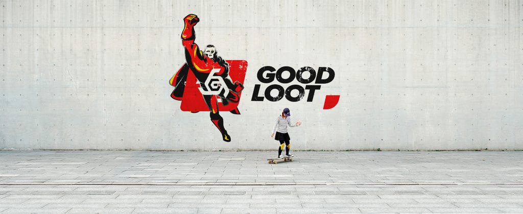
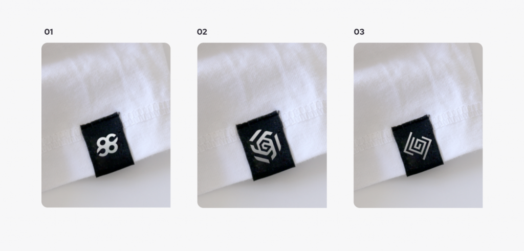
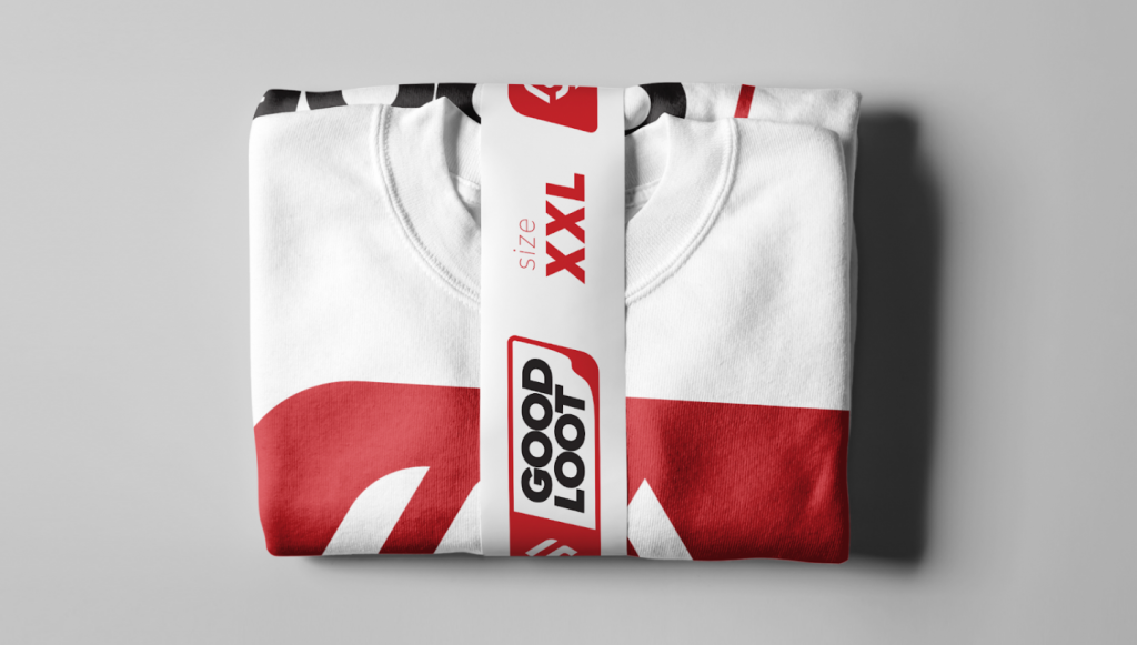
The mockups of the physical products were intended to inspire the GoodLoot team and show them that they can launch into the fashion space, thus showing the versatility of the final branding.
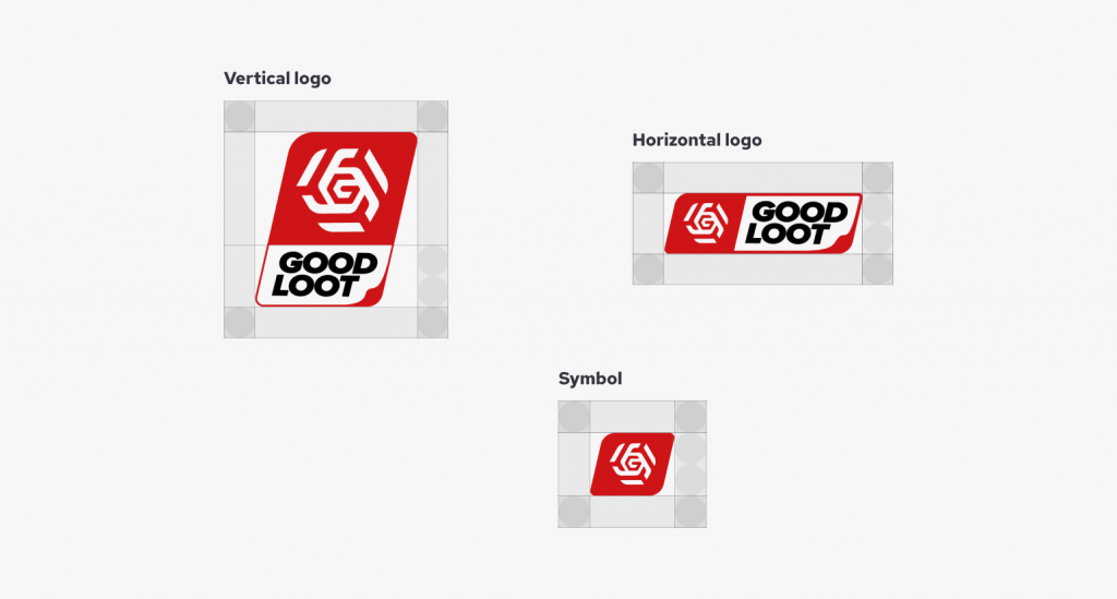
The final step was to create the brand book, fine-tune Pantone colours, and create printable, both colour and chromatic versions.
Results
Our client received a visual sign that represents the portal idea that the GoodLoot team loved. The portal connects both sci-fi and medieval fantasy lovers, but in a modern way.
The final design of the brand’s visual communication language has the versatility and scalability to be used in patterns, in digital, on clothing, on packaging and on a shelf. It’s strong enough to stand on its own or be used next to another product, without taking anything away.
Do you have a project in mind? Let’s create something together. Reach out

