About the new MADI
Invented by the Italian architect Renato Vidal and developed with Modula-re and Palladino Architects SA based in Switzerland, MADI is a patented housing solution for foldable modular living unit.
MADI uses traditional materials in an innovative modular home that unfolds to provide an affordable, high-quality living space quickly and easily.
MADI – under new ownership, needed a re-positioning of their brand and a completely new approach to the brand’s visual communication language that would evoke this new positioning.


Stakeholder alignment workshops
We have started the process started with brand strategy workshops. Our job was first to assist in the clarification of the new vision for the MADI brand. There are typically multiple perspectives and interpretations in the stakeholders minds of what the brand’s mission, vision and overall positioning translate to.
During the initial workshops on brand positioning and value proposition, we work as much to understand it ourselves, as to help everyone in the company get on the same page. Together with the key stakeholders we worked on their value proposition, customer personas, unique value proposition, competition benchmarking and their long-term business goals to find the voice of a brand that will embody expectations of both MADI and their customers.
Based on insights from the workshop, we moved to the sketches phase, which allowed us to hatch the main directions for the branding. Based on frequent conversations with the client, we smoothly shaped the visuals to their final form.


“M” is for MADI
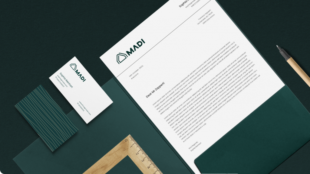
The final solution is a modern, geometrical logo design juxtaposed with irregular and subtle pattern imitating wood filaments. Symbol of the logo is a synthesis of the letter “m” and the basic shape of the MADI house.
Wood is the main resource used in production, hence timber lines as the main motif.
The logo consists of segments, which reflects the modularity of the houses. Interwoven lines are also a symbol of communion and familiarity. This treatment emphasizes the relation with nature, arouses the feeling of warmth and cosiness as well. Everything that MADIs stand for.


New website reflecting the branding
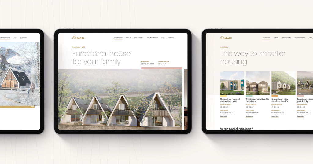
The next and the final step was to design a website that would reflect the new branding. The previous MADI website needed structured information architecture and a bit of a modern touch that would attract target audience.
We ended up with a cosy and modern website with elements from the new branding conveying the value of nature.


Do you have a project in mind? Let’s create something together. Reach out


